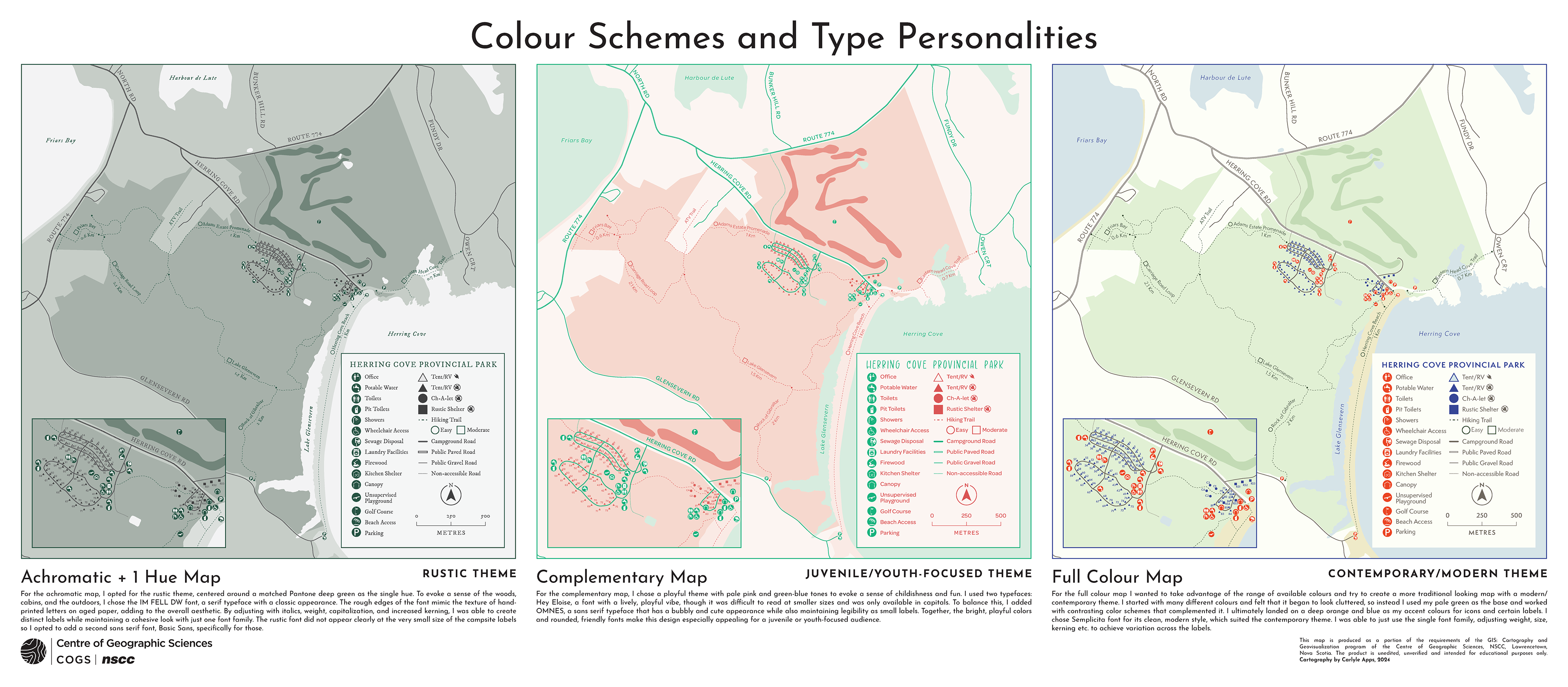
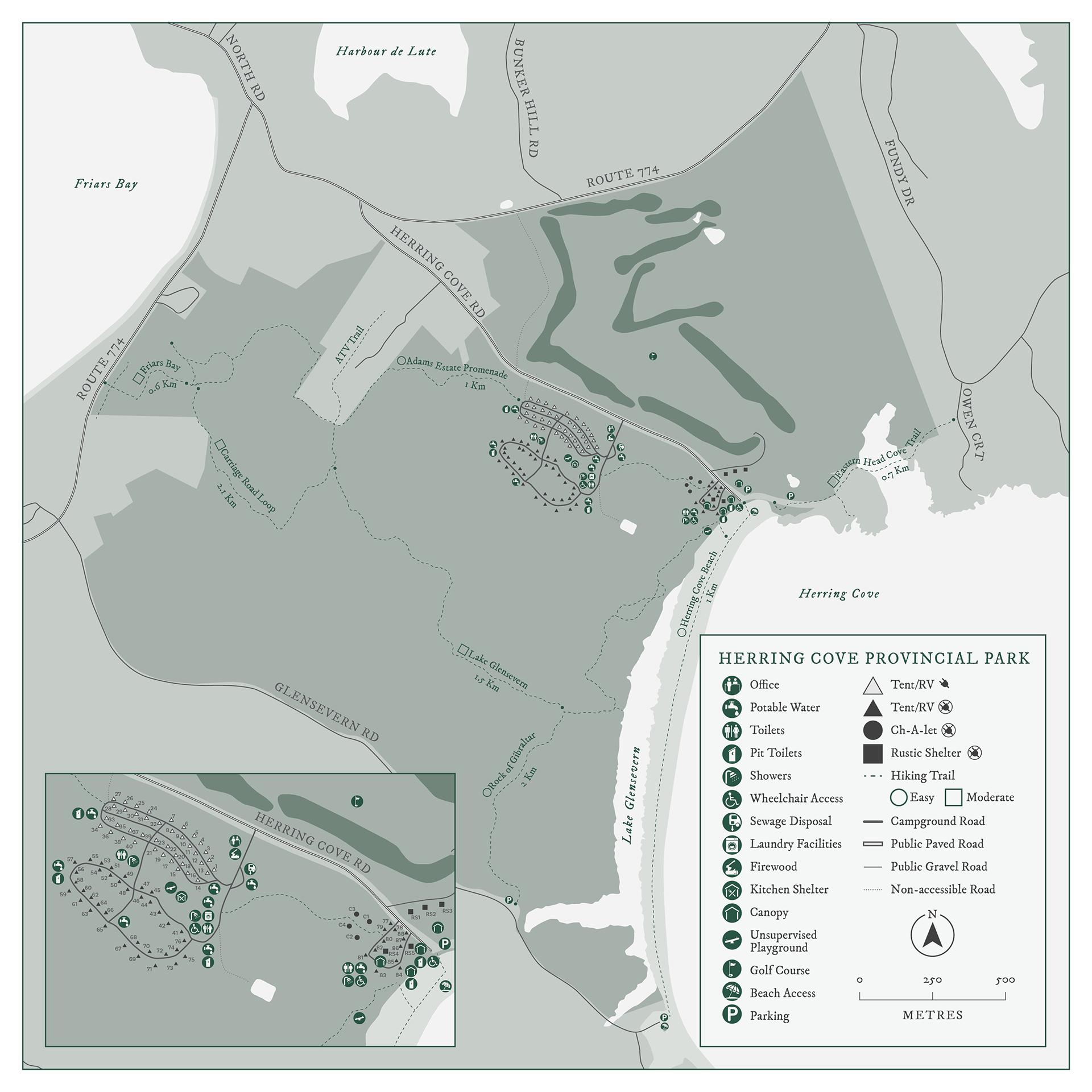
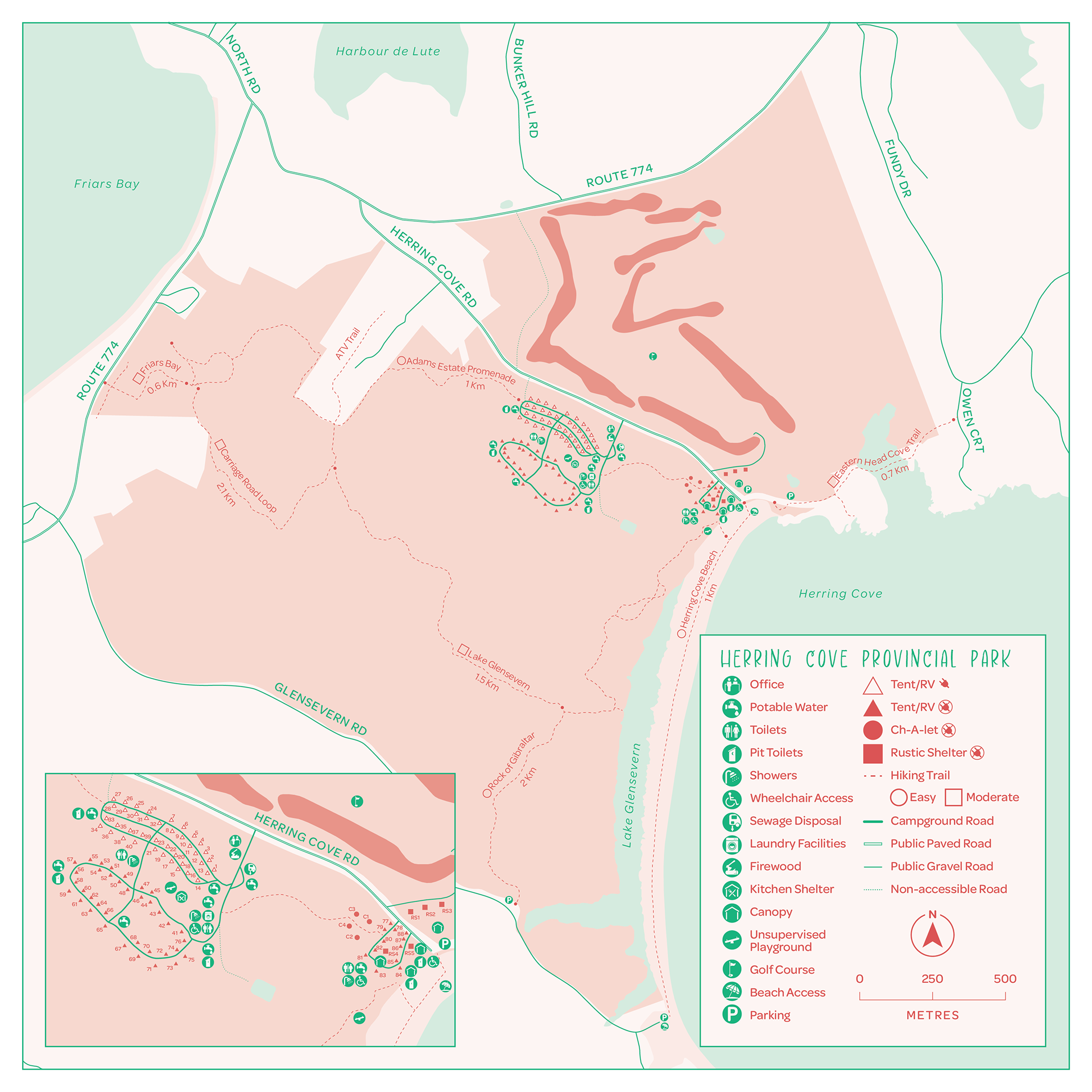
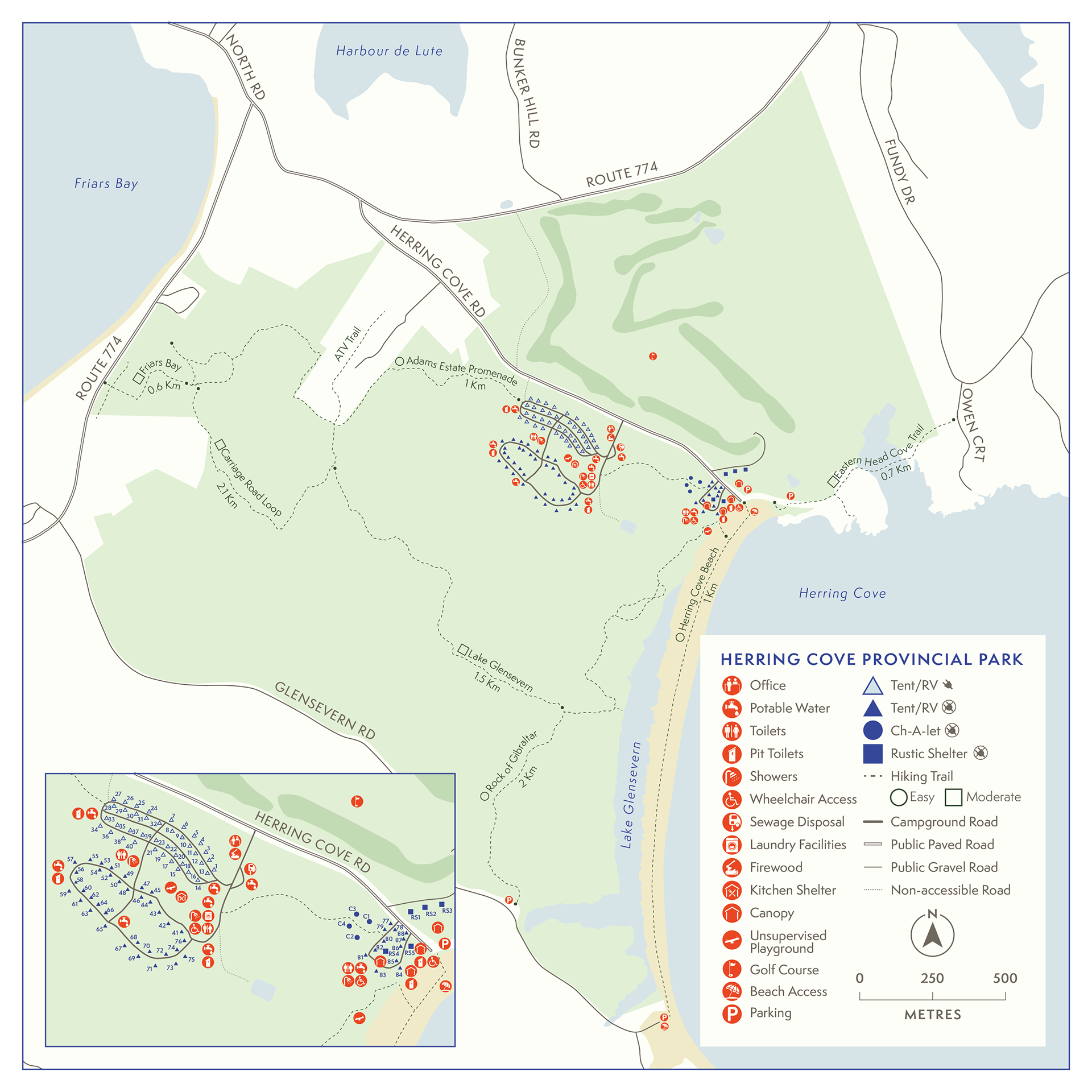
The goal of this project was to create a poster featuring three versions of the same map of Herring Cove Provincial Park, each styled with a different colour scheme and typographic theme. All three maps used the same base data but were designed to reflect distinct visual personalities:
1. Achromatic + one hue with a rustic theme
2. Complementary colours with a youth-focused theme
3. Full colour with a contemporary, modern theme
After preparing the data in ArcGIS Pro, I brought the maps into Adobe Illustrator to adjust symbology, fix label placement, and create custom icons. Typography and colour choices were guided by type personality principles, with a focus on clarity and consistency. The final poster was assembled in Adobe InDesign, aiming for a clean layout that let the visual differences between the maps stand out.